Bill and Eric

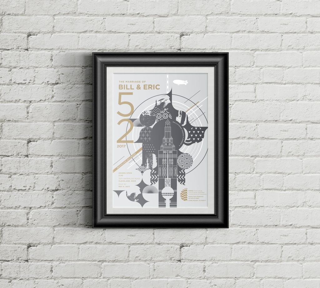
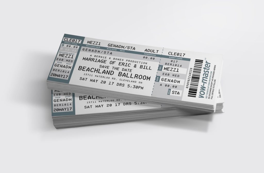
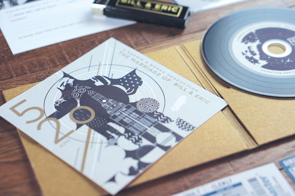
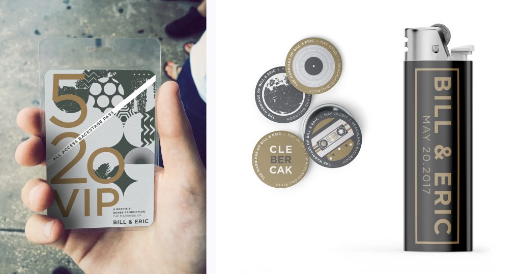
A BERNIE & BONES PRODUCTION

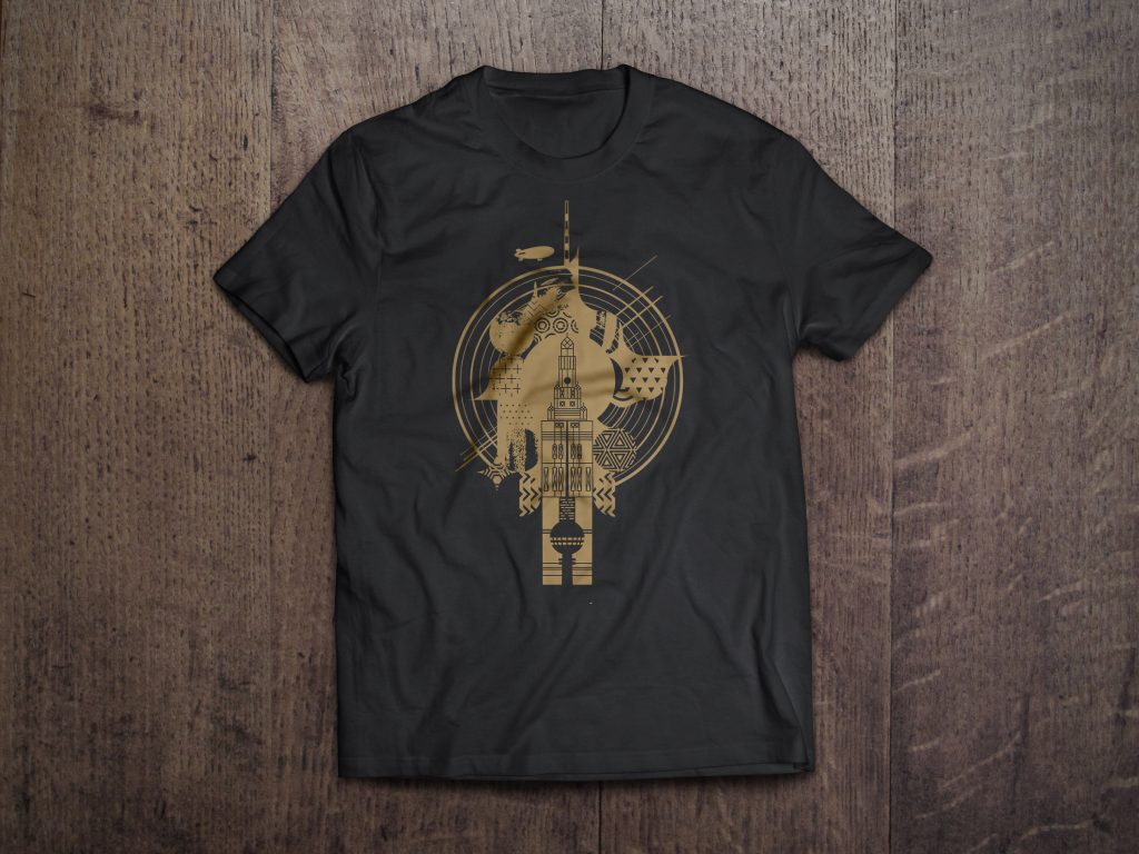
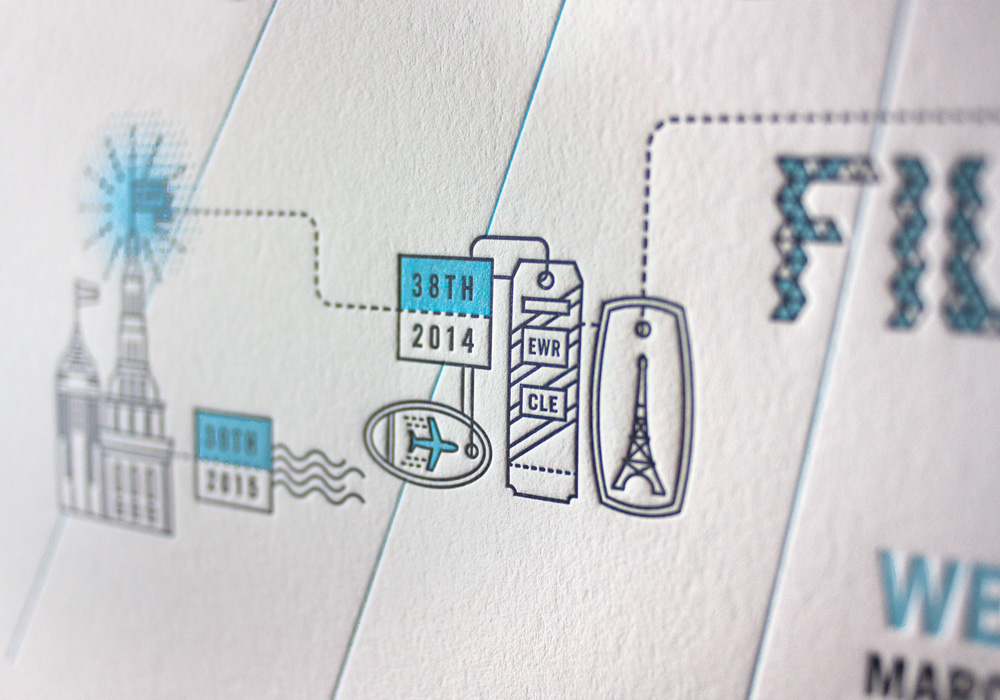
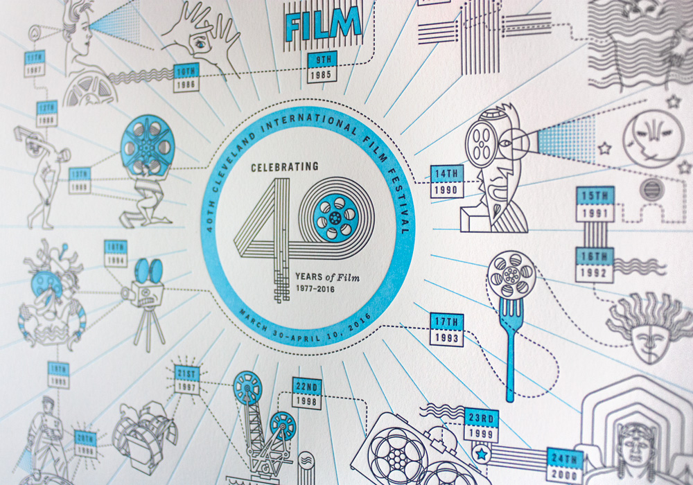
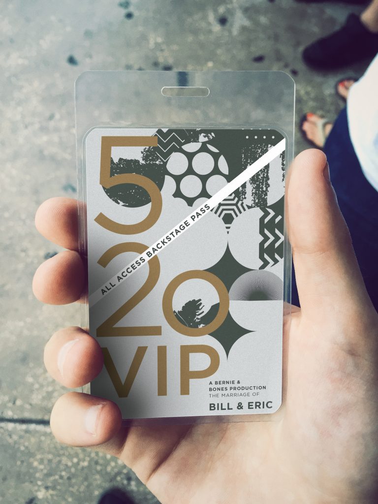
We were thrilled to have the opportunity to work with the fantastic couple—Bill & Eric. Their wedding—hosted in the Beachland Ballroom—was a concert themed event. The invitation suite was a complete package with: t-shirts, buttons, tickets, VIP passes, CDs containing the set list and wedding program, and custom lighters. The illustrations are an abstract blending of Cleveland, and Berlin, two cities that are very important to the couple’s relationship. At the wedding the posters were plastered all over the venue to create the atmosphere of a concert, and there was a merchandise table set-up for guests to pick out t-shirts, and grab buttons/lighters.

Phoenix Coffee Co.

PHOENIX COFFEE CO.

Type Twenty Seven is proud to be the creative partner to the Phoenix Coffee Co.

Phoenix Coffee Co. of Cleveland, Ohio was in the midst of a brand re-imaging in 2017.
The company has been operating and roasting coffee locally for 27 years, and was ready to pivot towards the future. This rebranding project was built from the ground up, getting to understand the history of the company, as well as the current culture and personality of the staff, leadership, and customer base.

This new brand reflects the playful and welcoming, yet professional approach that Phoenix has built around serving quality coffee at all 5 of their cafés. The company prides itself on being a welcome environment that provides a high standard of customer service with a great product.

Buildout included: coffee packaging, interior and exterior signage, t-shirts, coffee mugs, letterpress bookmarks, hot cup sleeves, business cards, and updated website visuals.

Crowe & Stoll Wedding Suite

Crowe & Stoll Wedding Suite

The Crowe & Stoll Wedding Suite is a project inspired by the couples love of nature and the outdoors. This led to a solution using letterpress printing to achieve extreme texture in the invites to look and feel like pieces of tree bark and wood.

The wedding invitation was designed to reveal the event information upon peeling the “tree bark” down. The suite included save the dates, invitations, program fans for the southern heat, and RSVP post cards.

Jamie Belkin Events

Jamie Belkin Events—World Medical Innovation Forum

This elegant event invitation and menu for Jamie Belkin Events were designed to focus on typographic information and highlighting sponsorships. The goal was to showcase the event partners for the World Medical Innovation Forum, and to create a feeling of dignified excellence.

This led to the solution of using type dominant design and printing in-house on our Vandercook Universal III letterpress machine. The pure cotton paper creates a very clean yet inviting mood for the viewer.


Specs: Letterpress printed on Reich Savoy Ultimate White cotton paper, and French Navy Blue Card Stock using our Vandercook Universall III printing press.

Desperate Times Brewery

Desperate Times Brewery

Located in Carlisle, Pennsylvania, Desperate Times Brewery takes its style from the prohibition era and the hand drawn signs of the twenties. The Brewery recently had their grand opening on December 7th, 2016.

The brand and name reflect this concept and play off hard times with the use of recycled chipboard for business cards, menus, and collateral materials. The bottle labels were designed and illustrated to reflect the hand made style of sign painters of the early 1900s.

The tap handles were designed to represent the the rugged handmade atmopshere of speakeasies and the barrels of prohibition rum runners. The handles are made from reclaimed wood and fabricated by Rustbelt Reclamation, with interchangeable full cast-iron toppers specifically produced for these handles by Borough Furnace.

Freimark Wedding Suite

Freimark Wedding Suite

An Athens Brick and floral inspired wedding in the historic town of Athens, Ohio was the perfect complement to the invitation design.

The challenge was to incorporate the couple’s Athens history with their love of floral patterns into the same design. The solution, using the iconic Athens Brick (known on the campus of Ohio University) as a blind impression to create a structured grid with floral patterns surrounding them. This was used in the various pieces of print material.


Specs: Printed on Neenah Wild Natural White 166# and 111# cotton papers.

Sferra & Walsh Wedding Suite

Sferra & Walsh Wedding Suite

The Sferra & Walsh Wedding Suite was designed with an art deco inspiration that stems from the couples love for that period of art and design. Patterns and decorative borders showcase a clean & modern take on deco typography.

Another element showcased in the work is the couples dog of many years. Her likeness was illustrated and used in the save the date cards as well as foiled napkins for the reception.


Specs: Letterpress printed on Neenah Wild Natural White 166# and 111# cotton papers using our Vandercook Universall III printing press.

39th Cleveland International Film Festival

Type Twenty Seven is proud to be the creative partner to the Cleveland International Film Festival, a non-profit organization that promotes artistically and culturally significant film arts through education and exhibition to enrich the life of the community.

In 2015, the CIFF held a record-breaking 12-day event by hosting 100,204 patrons (a 2.5% increase from the previous year), screening 196 feature films and 234 short subjects.

This year’s campaign focused on Cleveland, and the city being the home for inspiration, for film, visual arts, music, food, etc…


Buildout included: merchandise, interior and exterior signage, screen graphics, kiosks, advertising and augmented reality—a new interactive feature to bring the print elements to life.

RBF Colab Holiday Card 2015

RBF Colab Holiday Card 2015

RBF CoLab is a Collaboration of Architecture and Design located in Youngstown, Ohio. For the 2015 holiday season, Type Twenty Seven create a holiday card for RBF’s current, and prospective clients. Reflecting their current image, the sophisticated color and simple design was a perfect compliment to their brand.

Specs: Cards were produced using a 1967 Vandercook Universal III printing press. This process will produce a tactile feel where the ink is pressed into the surface creating an impression. Printed metallic silver ink on Reich Savoy Paper Ultimate White 92# cover 5″x7″.

40th Cleveland International Film Festival Special Edition Poster

The 40th Cleveland International Film Festival hosted a special event at Type Twenty Seven for the members of their organization on Jan 27, 2016. This event showcased the three CEOs of the Film Festival since it’s inception, as well as a letterpress demonstration. The attendees had an opportunity to print their own limited edition 40th campaign poster. The poster design showcases the evolution of the past 40 years of the Film Festival’s advertising campaigns.

Specs:Print was produced using a 1967 Vandercook Universal III printing press. This process will produce a tactile feel where the ink is pressed into the surface creating an impression. Printed 2 colors at 16″x20″ on #111c white Neenah Crane’s Lettra.